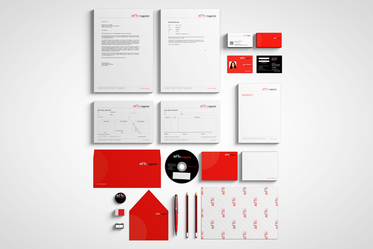
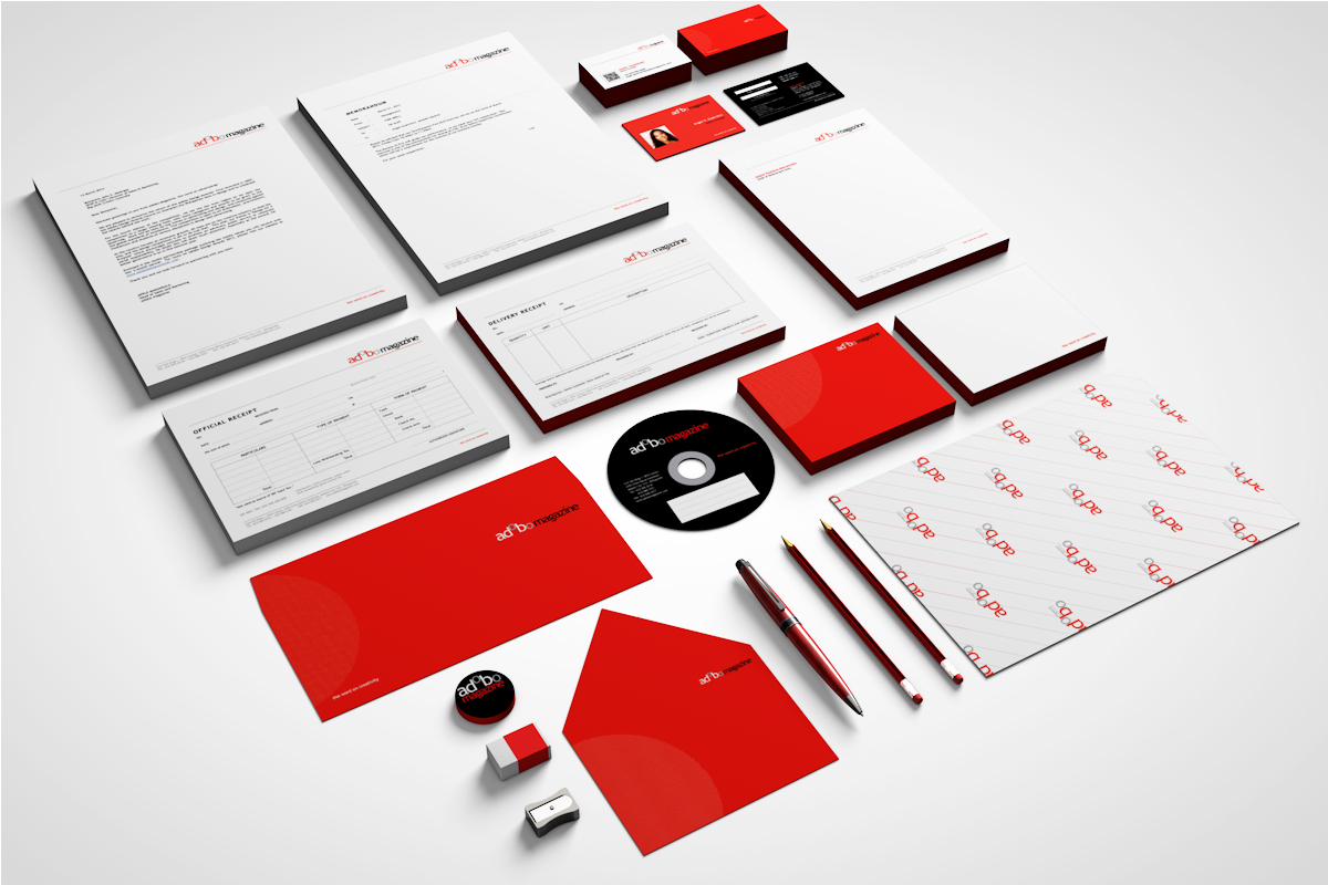
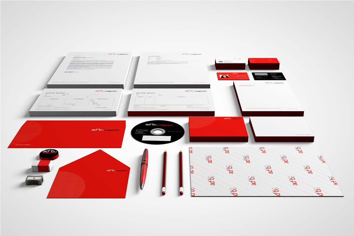
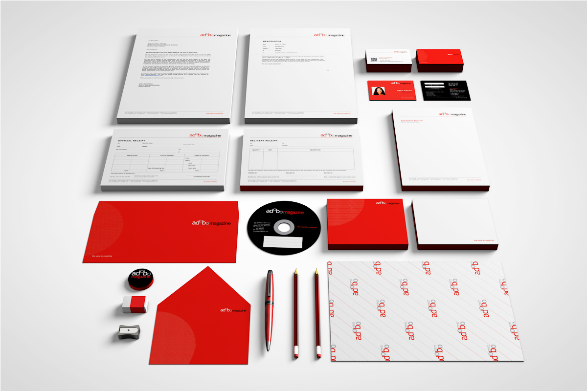
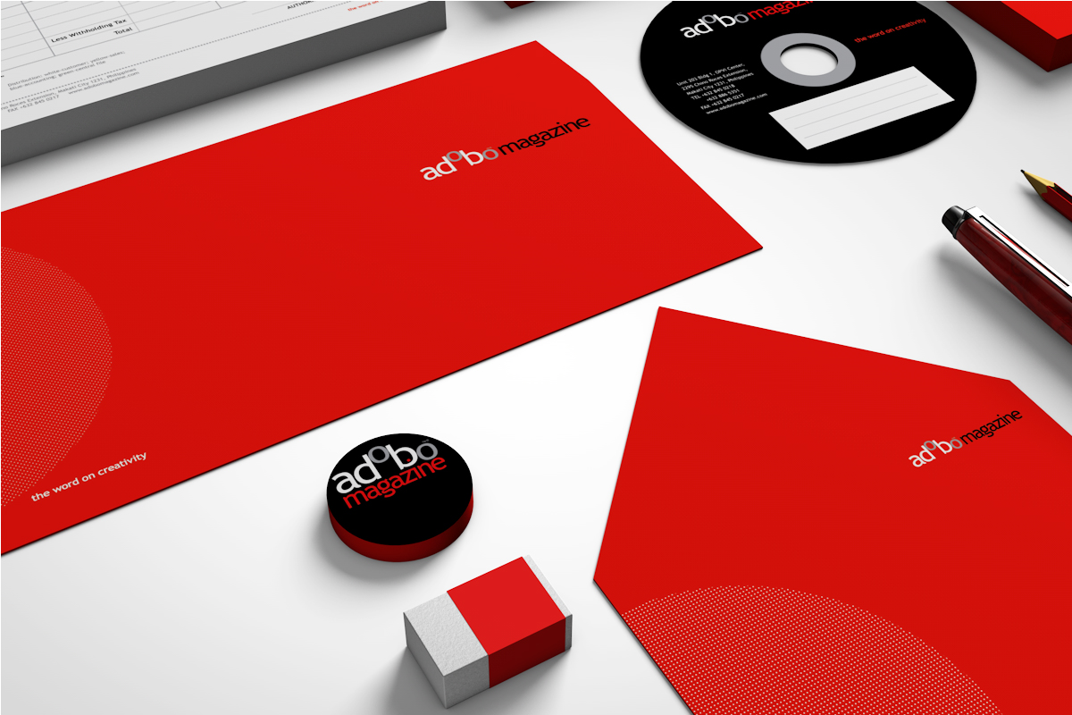
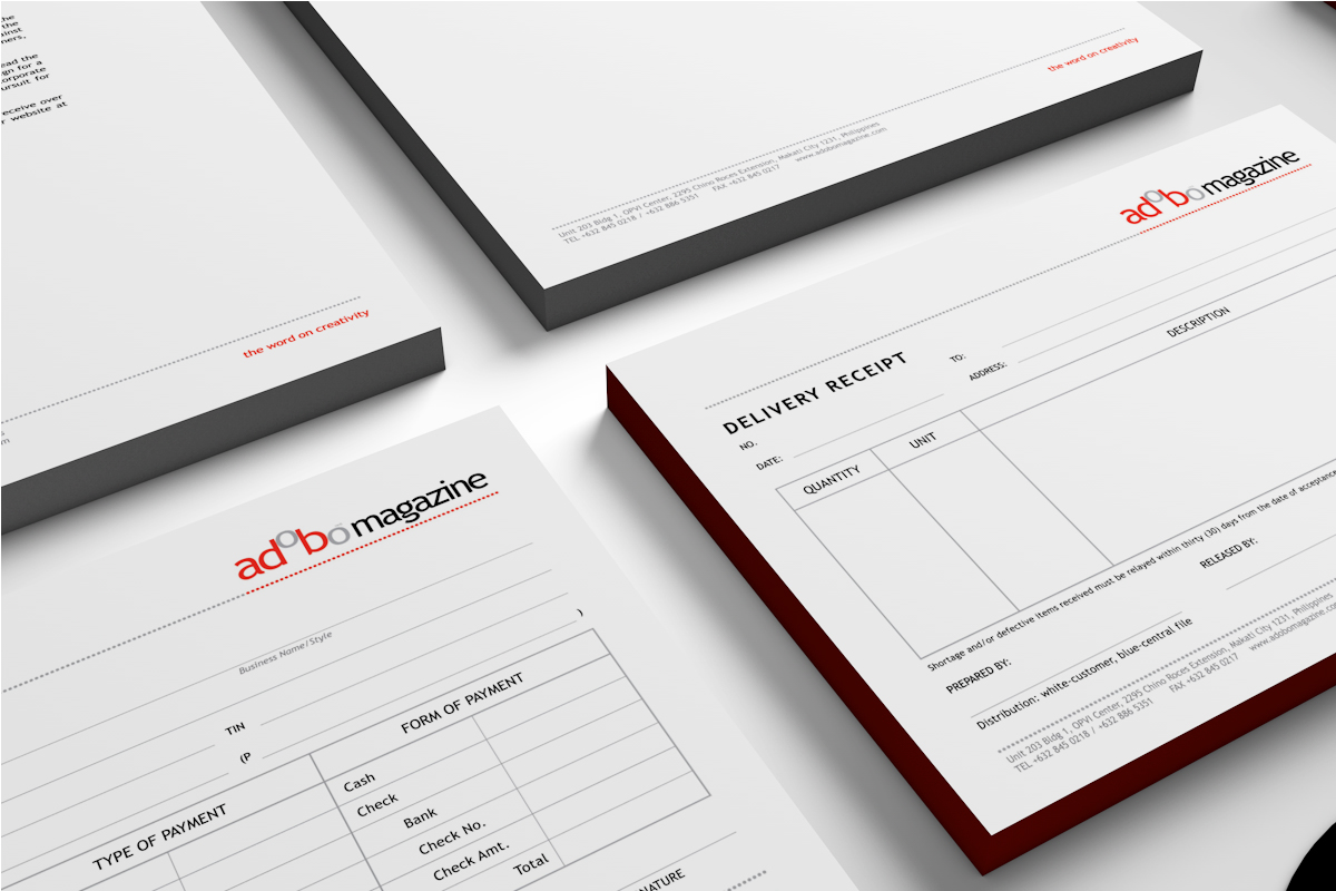
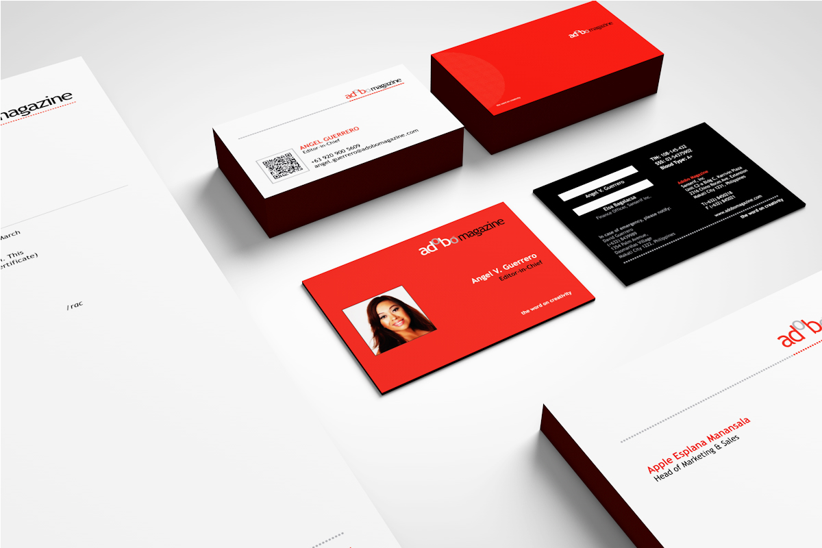

Being long-time partners with Adobo Magazine, it is just apt for TeamManila to design the company’s business collaterals as to set a more consistent look for the brand. With the red, black, and white colors, dots turned into lines are seen in Adobo Magazine’s letterheads, CD covers, and business cards to name a few. A project that is slick and precise with Adobo Magazine’s brand and TeamManila’s aesthetic, this project translates the company’s tagline “The Word on Creativity.”